Native Hebridean
Food Branding & Packaging Design
The Scottish Salmon Company has developed its own 'native strain' of salmon broodstock. Only salmon that share this pure Scottish island lineage and which are born, reared and harvested on the Hebrides qualify as Native Hebridean. Lawrence Creative were tasked with creating a brand identity for this unique product.
Output : digital / print / branding / packaging
Brand
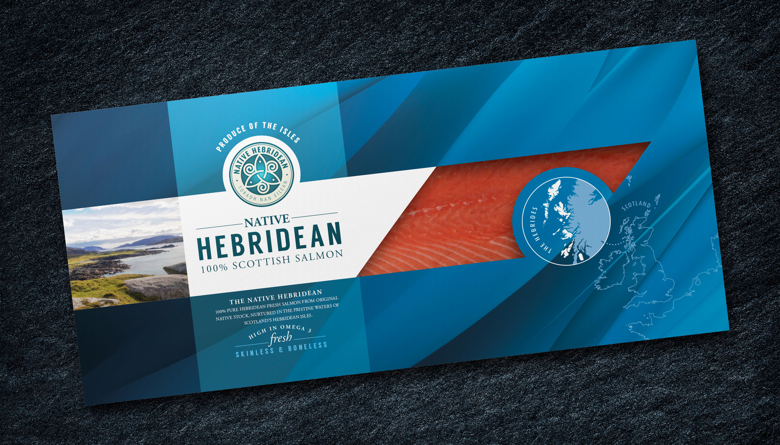
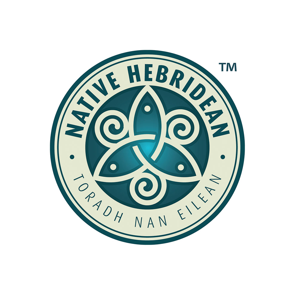
The brand takes its inspiration from the historic art of the Hebridean Islands, specifically the knot-work style seen throughout the islands history. A central graphic was developed which portrayed three salmon set within a background of waves, thus identifying both the product and the origin. This was then set within a roundel which contained the product name and also the Gaelic phrase ’Toradh nan Eilean’ meaning ‘Produce of the Isles’ adding to the products Scottish credentials. The colour scheme was chosen to reflect the aquamarine of the Hebridean seas and the soft white sands of the coastline.
Packaging
The packaging style was developed to provide good on-shelf presence and to set it apart from its competitors. A visual sense of the cold clear sea loch waters of the salmons environment is suggested by use of an abstract background which subtly suggest the play of light through the waters. The salmons origin is firmly established through the use of a map which highlights the Hebridean Islands. By using traditional typesetting techniques combined with the other elements the overall feel is that of an artisan product of value.
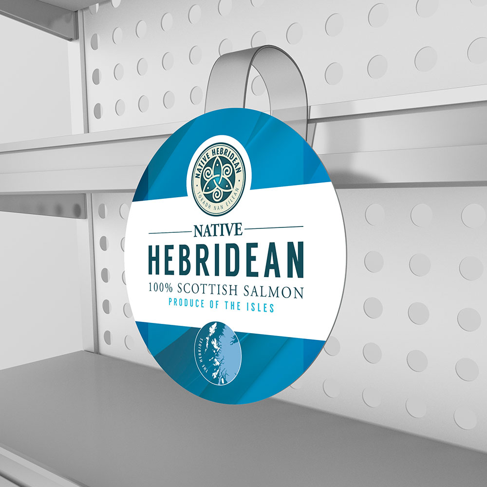
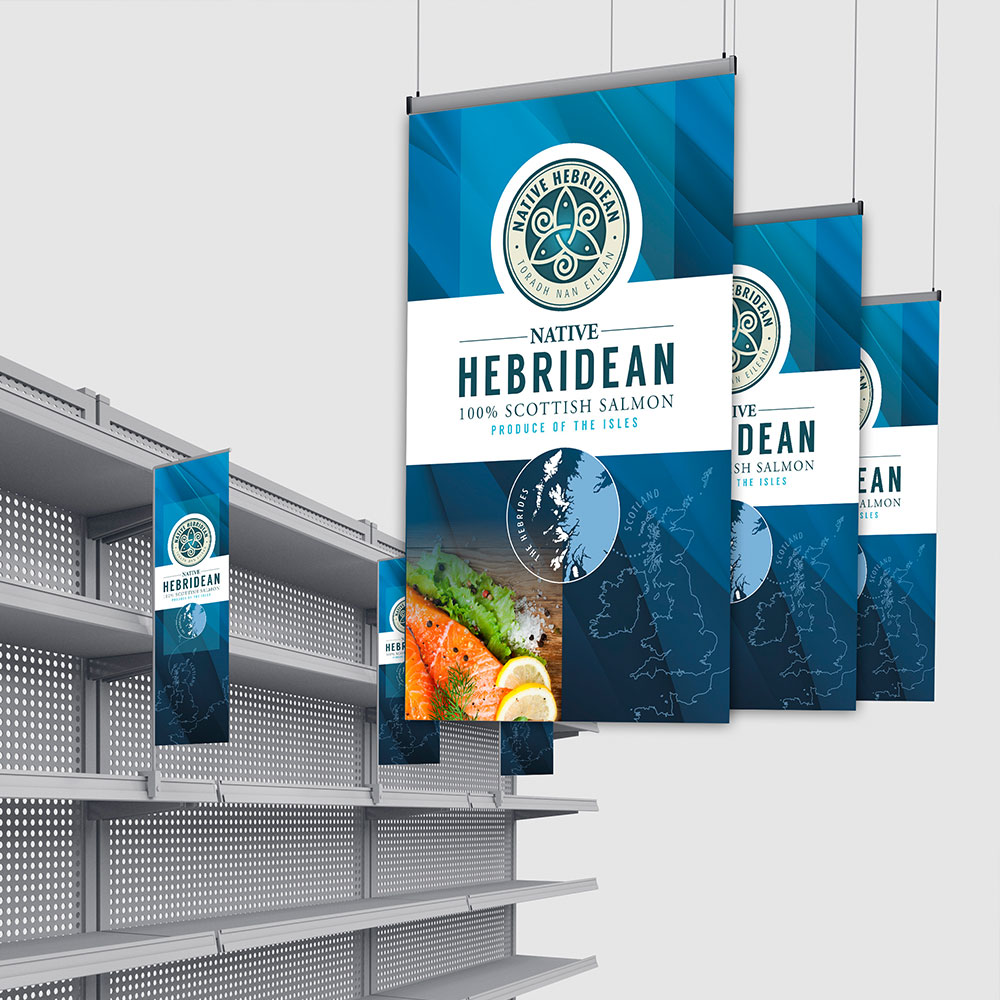
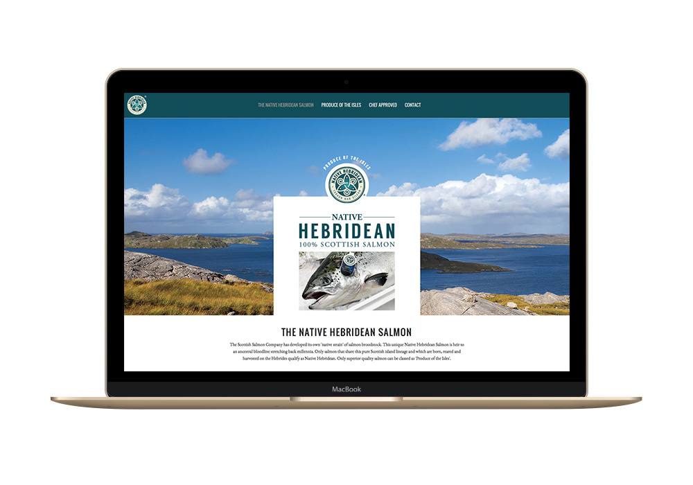
Point of sale and website
As part of the promotion and marketing of the brand suggestions for point of sale material and a product specific website were also produced for client consideration.